Images make up a significant portion of the average webpage's weight. Optimizing them is one of the most effective ways to improve your website's performance, user experience, and SEO ranking. This guide covers everything you need to know about image optimization.
 Image size reduction through optimization while maintaining visual quality
Why Image Optimization Matters
Unoptimized images can significantly slow down your website, causing:
- Higher bounce rates
- Lower conversion rates
- Poorer user experience
- Reduced SEO rankings
Google's Core Web Vitals metrics, particularly Largest Contentful Paint (LCP), are directly impacted by how quickly your images load.
Key Image Optimization Techniques
1. Image Compression
Image compression reduces file size while maintaining acceptable visual quality. Modern compression algorithms can reduce file sizes by 60-80% with minimal quality loss.
Our image compression tool uses advanced algorithms to optimize your images without significant quality degradation, offering the perfect balance between file size and visual fidelity.
2. Choosing the Right Format
Different image formats have different use cases:
- JPEG: Best for photographs and complex images with many colors
- PNG: Ideal for images requiring transparency
- WebP: Modern format with superior compression for both lossy and lossless compression
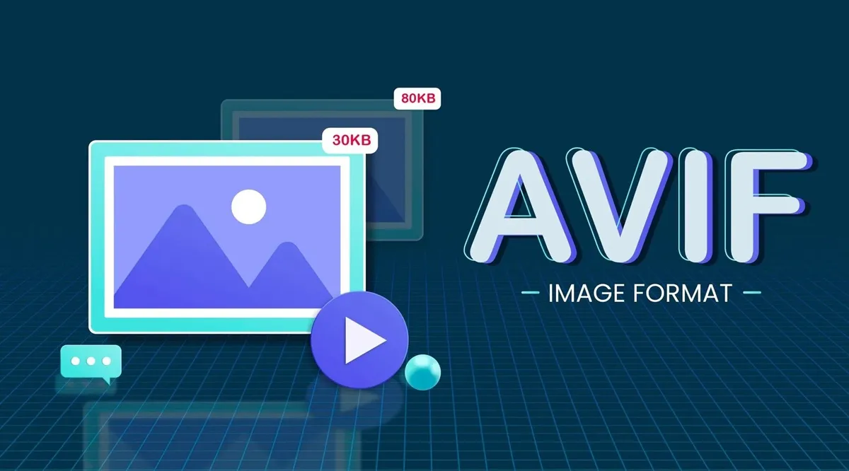
- AVIF: Next-generation format with excellent compression efficiency
 Visual comparison of image quality and file size across different formats
Our image converter tools can help you convert between formats to find the optimal balance:
3. Resizing Images Appropriately
Serving appropriately sized images for different devices is crucial. There's no need to serve a 2000px wide image to a mobile device with a 400px wide screen.
Our resize image tool and batch resize image tool can help you create multiple versions of your images for different device sizes.
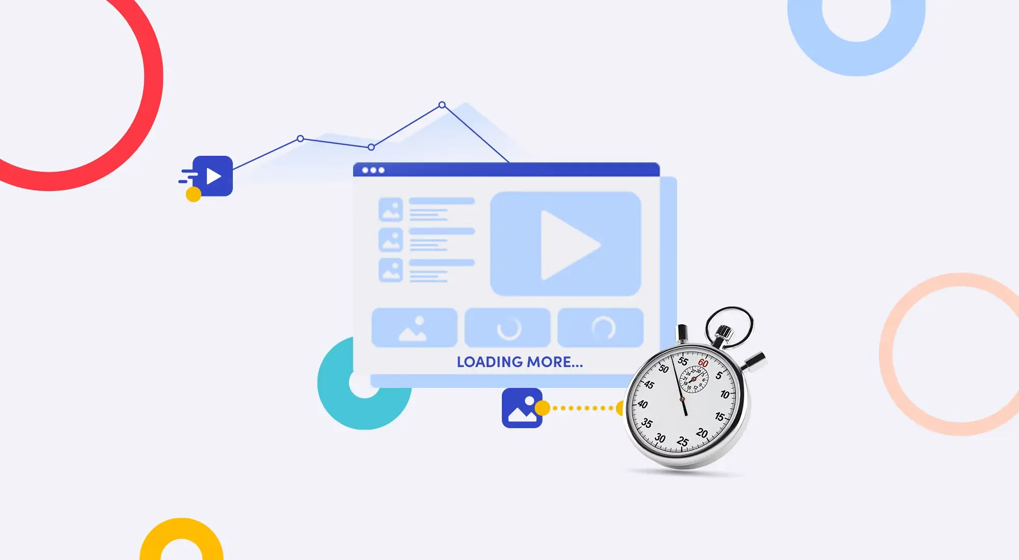
4. Lazy Loading
Implementing lazy loading ensures images load only when they enter the viewport, reducing initial page load time. While this requires coding implementation, properly sized and compressed images make lazy loading even more effective.
Advanced Techniques
Responsive Images
Use the HTML srcset attribute to serve different-sized images based on the device's display:
<img
  srcset="/img-small.webp 400w, /img-medium.webp 800w, /img-large.webp 1200w"
  sizes="(max-width: 600px) 400px,
            (max-width: 1200px) 800px,
            1200px"
  src="/img-large.webp"
  alt="Responsive image"
/>
Image CDNs
Consider using image Content Delivery Networks (CDNs) for global distribution and on-the-fly transformations.
Measuring Impact
After optimizing your images with our image compression and image converter tools, use tools like Google PageSpeed Insights or Lighthouse to measure the improvement in your page load times.
Additional Image Processing Tools
Besides compression and format conversion, we offer several other useful image processing tools:
 Our suite of image processing tools for various editing needs
- Watermark Image - Add branding or copyright information
- Crop Image - Remove unwanted portions of images
- Rotate Image - Correct image orientation
- Image to Base64 - Convert images to base64 encoding for inline HTML usage
- Extract Color from Image - Identify key colors from your images
Conclusion
Image optimization is not a one-time task but an ongoing process. As new formats and compression techniques emerge, staying updated helps maintain optimal website performance. Regularly audit your website's images and use our suite of image optimization tools to ensure your website remains fast and user-friendly.
Start with our image compression tool today and see the difference it makes to your website's performance!